This week I was tasked with building a new site for an org within our company. The organization does not have much content and plans for it to be a gateway site for Sales people to get what they need. The management of the group too did not really want to meet to discuss design or content but just gave a few broad strokes to paint with. So I came up with two very simple clean designs that can be expanded as time goes by and their needs become greater. Built for the company standard browser of MSIE 8 with compatibility view on or off (there are slight differences). The footer is fixed to the bottom in both these designs so the pages scroll vertically if content exceeds page height.
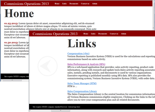
Site 1 – Horizontal sliding pages.
Since not much content I can use big fonts and sliding effects to make the site more interesting. I am limited to the standard pc fonts (TIMES, GEORGIA, etc.) so making them bigger emphasized their characteristics. In the image below you can see the HOME page in the start position, and the LINKS page still sliding in. Uses JQuery to achieve the slide effects.
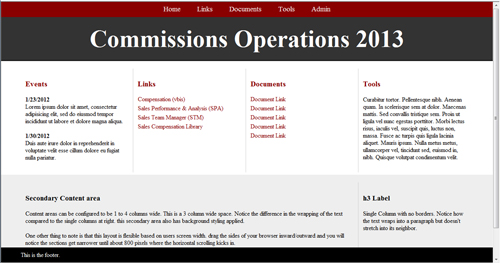
Site 2 – 4 Column static with primary and secondary content areas.
Just in case the management doesn’t like the sliding menu and big fonts I created more of a static version with similar elements for examples.
Based on a simple 4 column grid this site can be very flexible in its design on the HOME page and back pages. It is somewhat responsive down to about 800 pixels. We do not have interal sites that can be accessed via tablets or smartphones yet. I built the CSS with the future in mind however and have additional responsive stylesheets ready to implement.
I am not sure either of these designs will be accepted but I like them.